TUNE: Snapshot Charts
Overview
With the rise of other performance marketing platforms, TUNE was feeling pressure to update HasOffers, which hadn't seen a visual overhaul since it's inception in 2009. There was little incentive to update it given its success and status as the market-leading platform of its type.
Not content to be disrupted in the way Apple disrupted Nokia we decided to aggressively pursue new features and update older ones that had grown stale. I was on the team that lead that effort and as part of it, I redesigned the main visualization that users see when they first log in to the platform.
The Problem
The old chart used dual axes to compare two different metrics—money and activity: users see what their profit is combined with how many clicks they had and how many of those became a conversion. Unfortunately, they were left to calculate their conversion rate (clicks divided by conversions) for themselves, which we had discovered was an issue during one of our field studies.
The Approach
In order to reduce the amount of noise on the page, I chose to follow data visualization best practices as outlined by practitioners like Stephen Few and Noah Iliinsky: one chart was broken into two so that each metric had its own focus. I didn't want users to have to spend a lot of time thinking about what they were looking at (dual axis charts take a little more interpreting than single axis ones do). I also used the idea common to financial data as shown on sites like Yahoo Finance to illustrate click and conversion volume in its own sub-graph.
Given that the team on this project was quite small and we were working with Formidable's Victory charting framework we were able to implement all of the interactions I had designed.
Learnings
After the chart went into Beta we immediately discovered that I hadn't anticipated for how it behaves when users lose money. Another issue that arose was on some monitors the two shades of green representing the profit periods being compared sometimes blurred together. I started experimenting with different. This also made me realize that working with "fantasy" data sets was counterproductive and for my subsequent projects, I began using real data.
One thing I hadn't anticipated was that some of TUNE's customers preferred the dual axis version to the chart existing in two tabs. To address this issue we decided to run a survey 6 months after its completion to see how they felt about the chart and what we might be able to do to improve it. However, I left TUNE before the follow-up survey was launched.

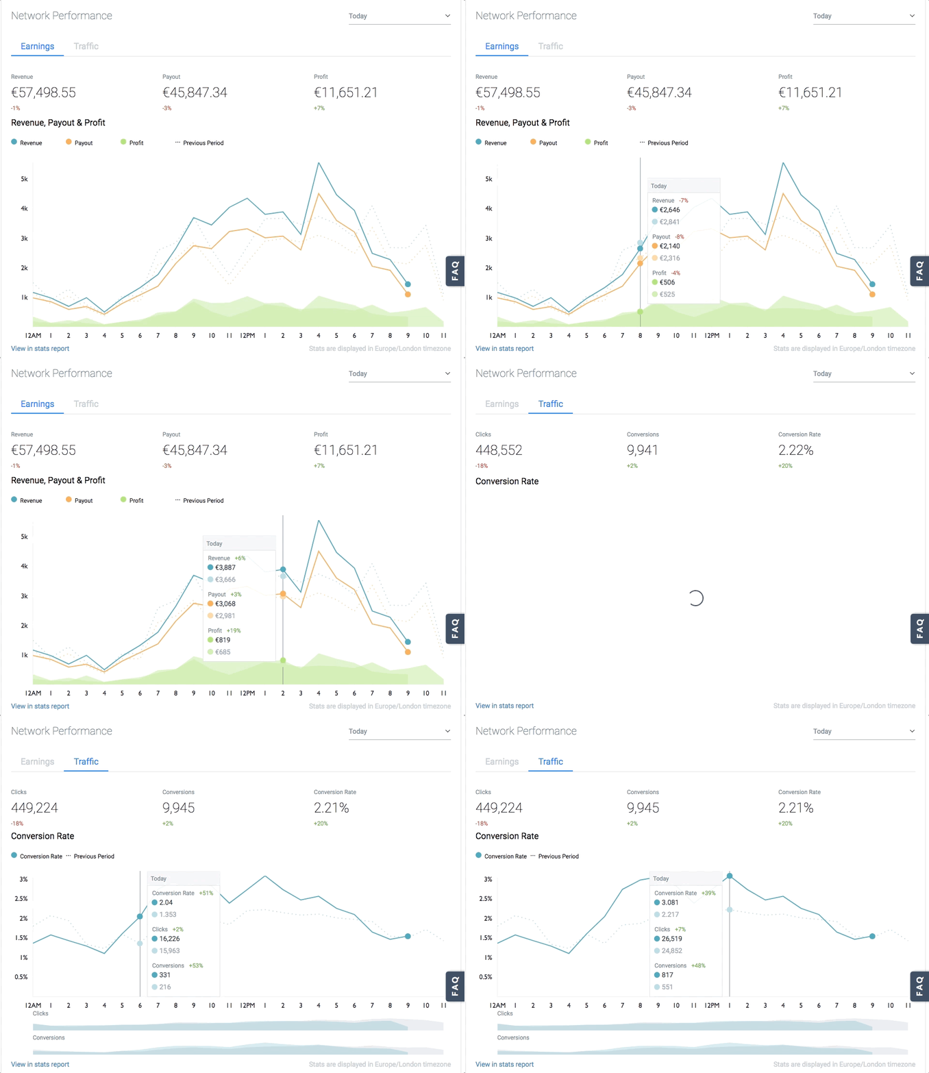
The final version of the chart as released. What you see is a screen capture of live data from a customer's account and all of the behaviors associated with interacting with the graph.

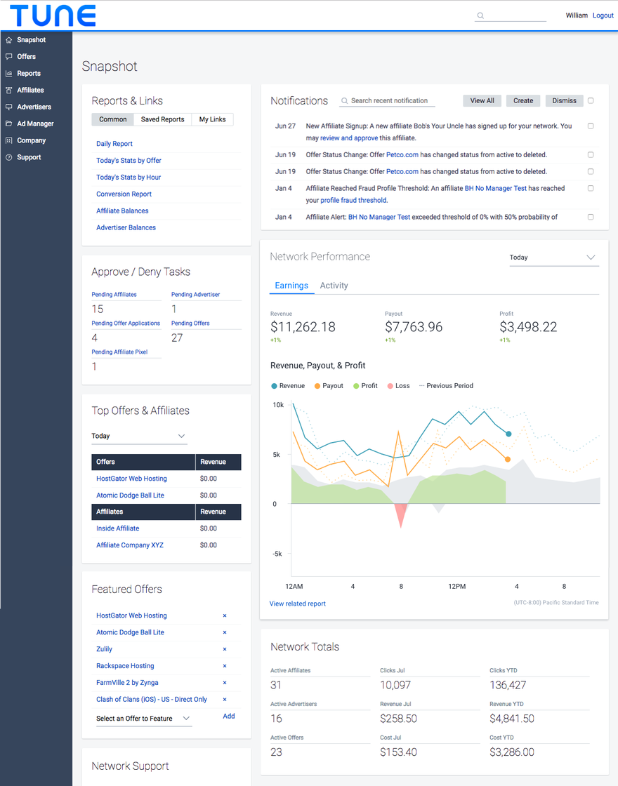
The original version of the chart in context. The Snapshot page is the equivalent of a dashboard and is the first thing users see when they log into HasOffers.

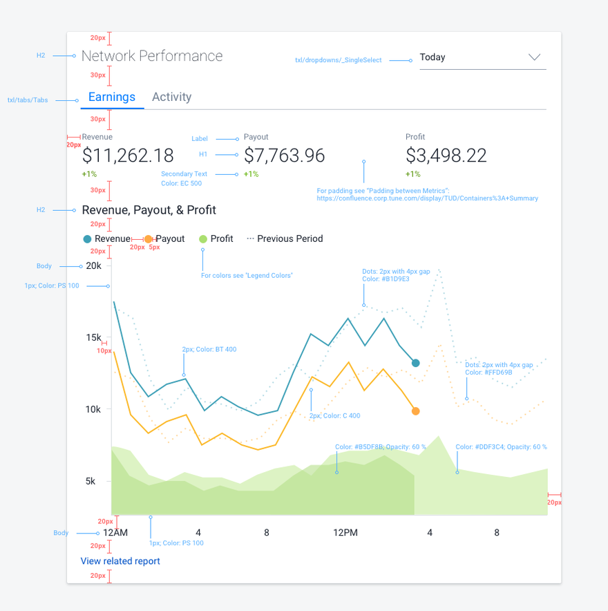
The updated version of the chart. I split one chart into two and added data from the previous equivalent period (today vs. yesterday, last week vs. previous week, etc.). The timeframes we allowed people to choose were Today, Yesterday, Last 7 Days, Previous Week (Saturday - Sunday), Month to Date, Last 30 Days, and Previous Month. Given the nature of our customers' businesses, anything outside of those timeframes was considered irrelevant.

During a field study, we discovered that the number of clicks and conversions aren't as important as seeing the actual conversion rate which wasn't revealed anywhere. Users could still see the individual numbers and their comparisons by hovering over the chart, which is shown in a few slides.


